+ BRAND IDENTITY + STRATEGY + WEBSITE
+ WINTER | 2024
+ EDUCATION SECTOR
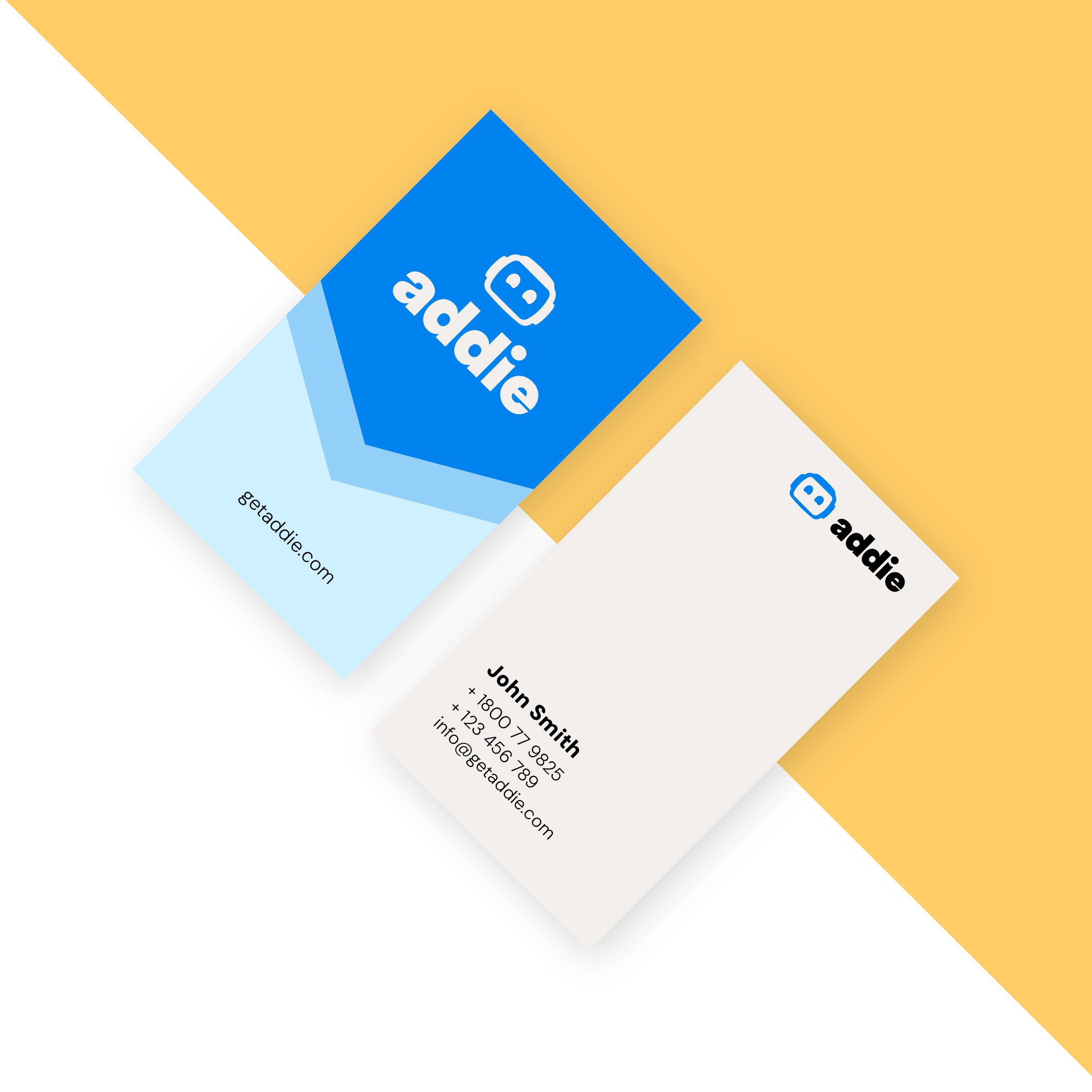
+ LOGO SUITE, INVESTOR DECK, WEBSITE
Addie
An AI Agent that gives school counselors superpowers by providing personalized, evidence-based, college application support, at scale.
Families of the wealthiest students are spending $20K to have a college counsellor spend more than 100 hours with them, crafting their narrative, students from wealthy families significantly increase their odds of getting accepted to top schools. Making them 2x more likely to be admitted.
All the other students have the same credentials but lower chances and minimal resources and support.
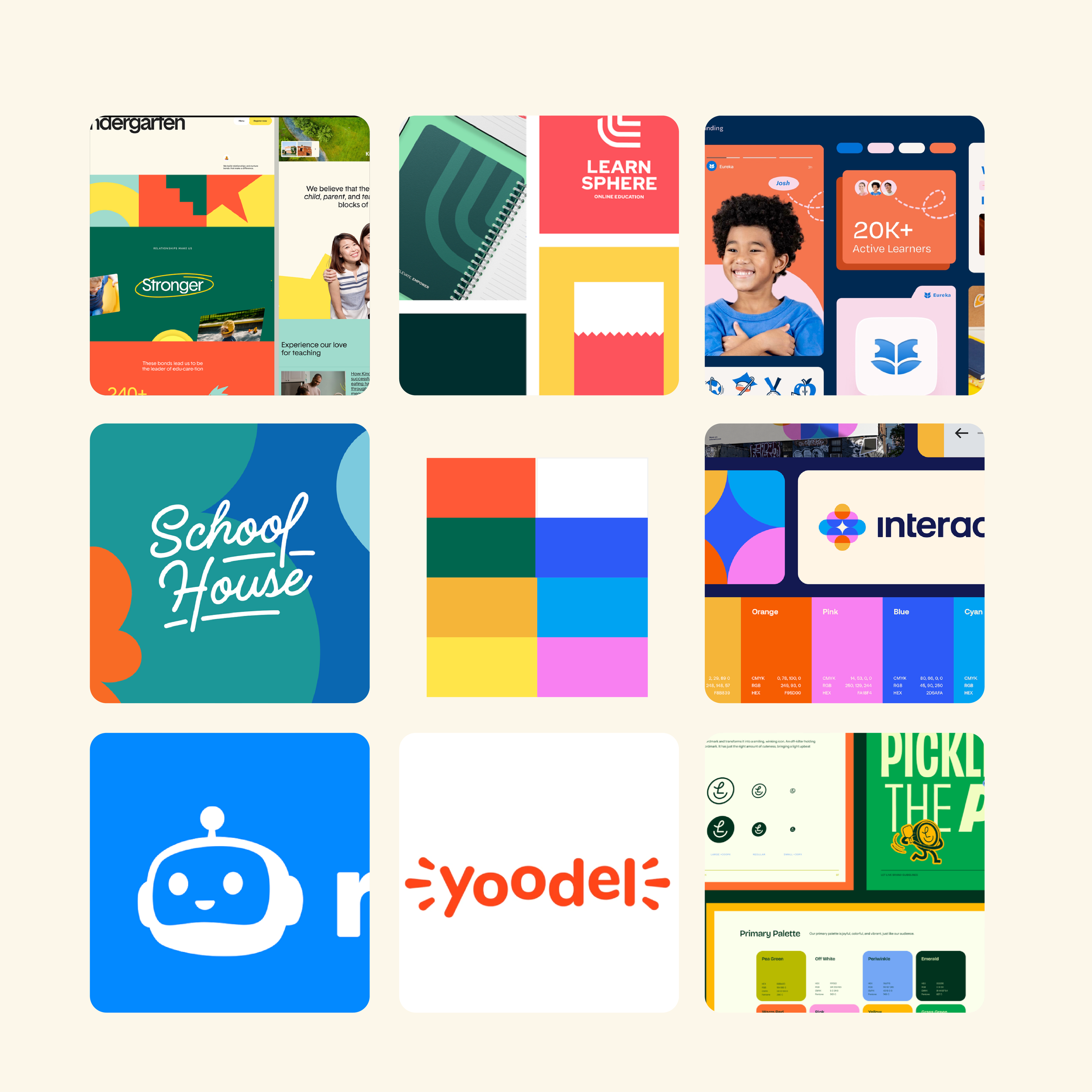
The design process
With every brand design project we have the client fill out a design brief to go over the brands values, target audience, goals. I take this information and conduct a competitor analysis to see how we can differentiate the brand in the competitive landscape.
Addie helps high school students navigate the complexities of college applications, from school selection to essay brainstorming, much like a human advisor. While on the flip slide Addie is designed to relieve overwhelmed school counsellors by providing students with personalized guidance and insights, even when counsellor-student ratios are high.
Knowing the goal of the brand we collaborated and identified the brands vision and mission. Addie’s core mission is to democratize access to high quality college admission advice. Levelling the playing field for students regardless of socioeconomic background.
Given these mission and goals we wanted to create a brand that is approachable, helpful, friendly and most of all trustworthy.
Based on the brand strategy being defined we now draft directions of the brand tone and visual direction.
MoodboardBRAND WORDSFriendly
Trustworthy
Approachable
Helpful
First Round of Logos
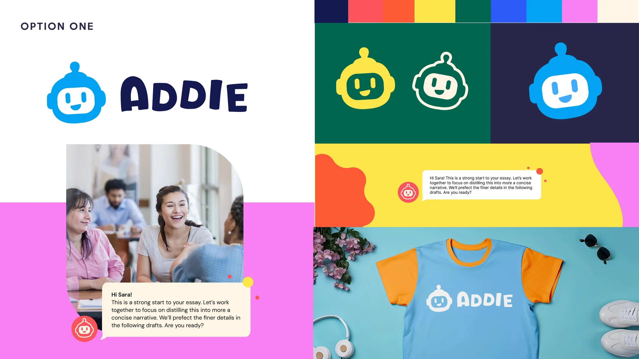
Option One
While the overall feeling and execution hit the brand words of friendly, approachable, and helpful, it felt too youthful for the teenage demographic.
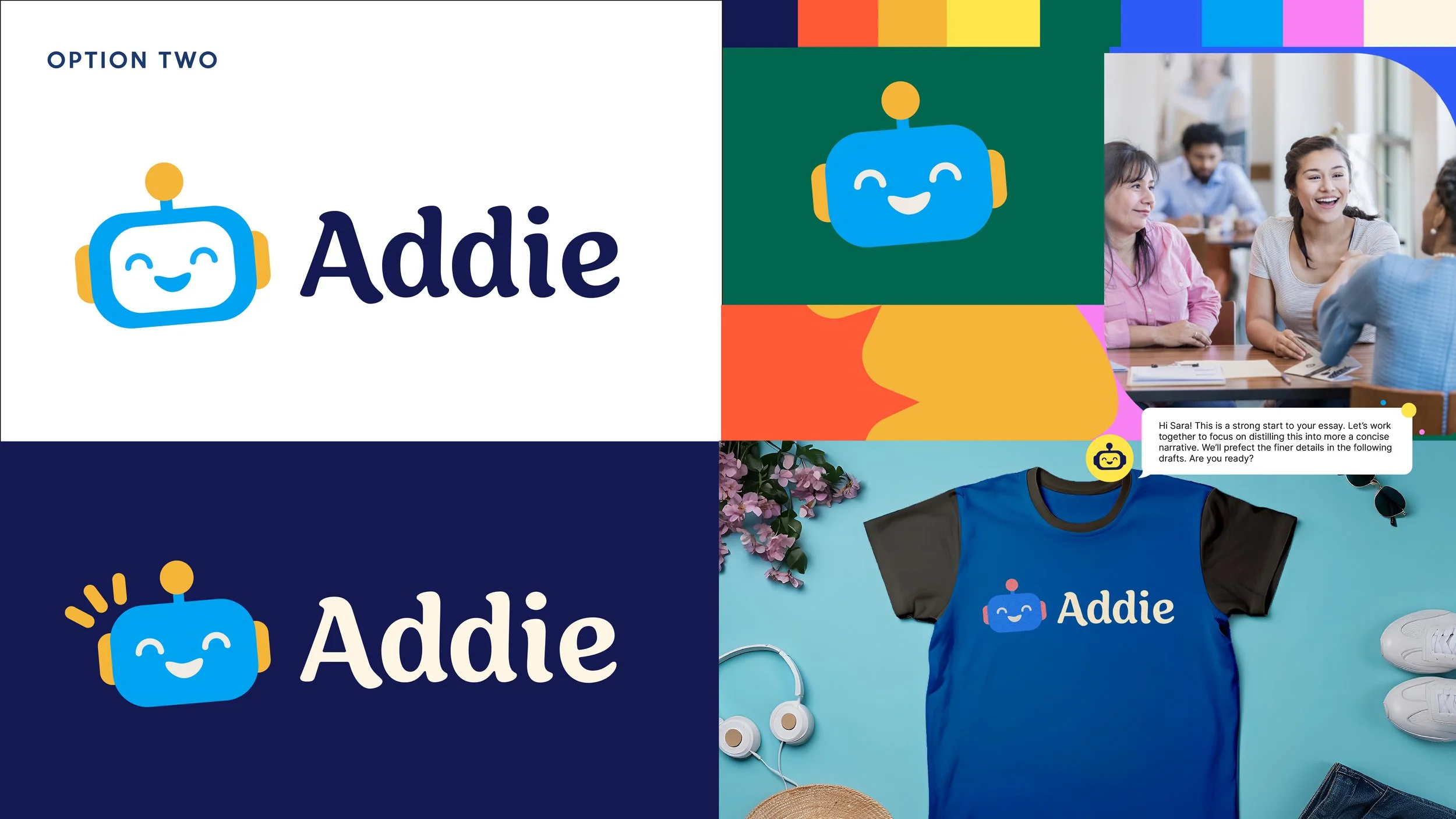
Option Two
Once again this version hit the friendly, approachable brand words. However it also had the youthful feel.
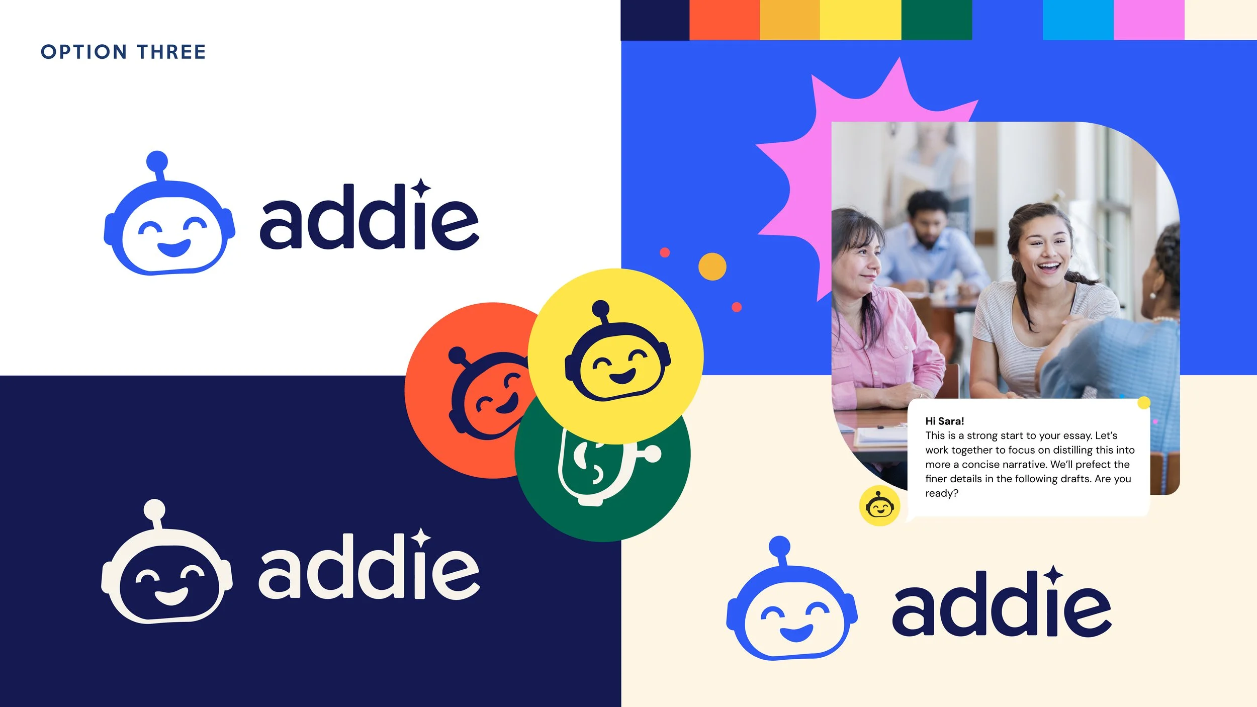
Option Three
This option was closer to hitting all brand values and tone out of all the options shown. We decided to expand upon this version and fine tune it a bit more.
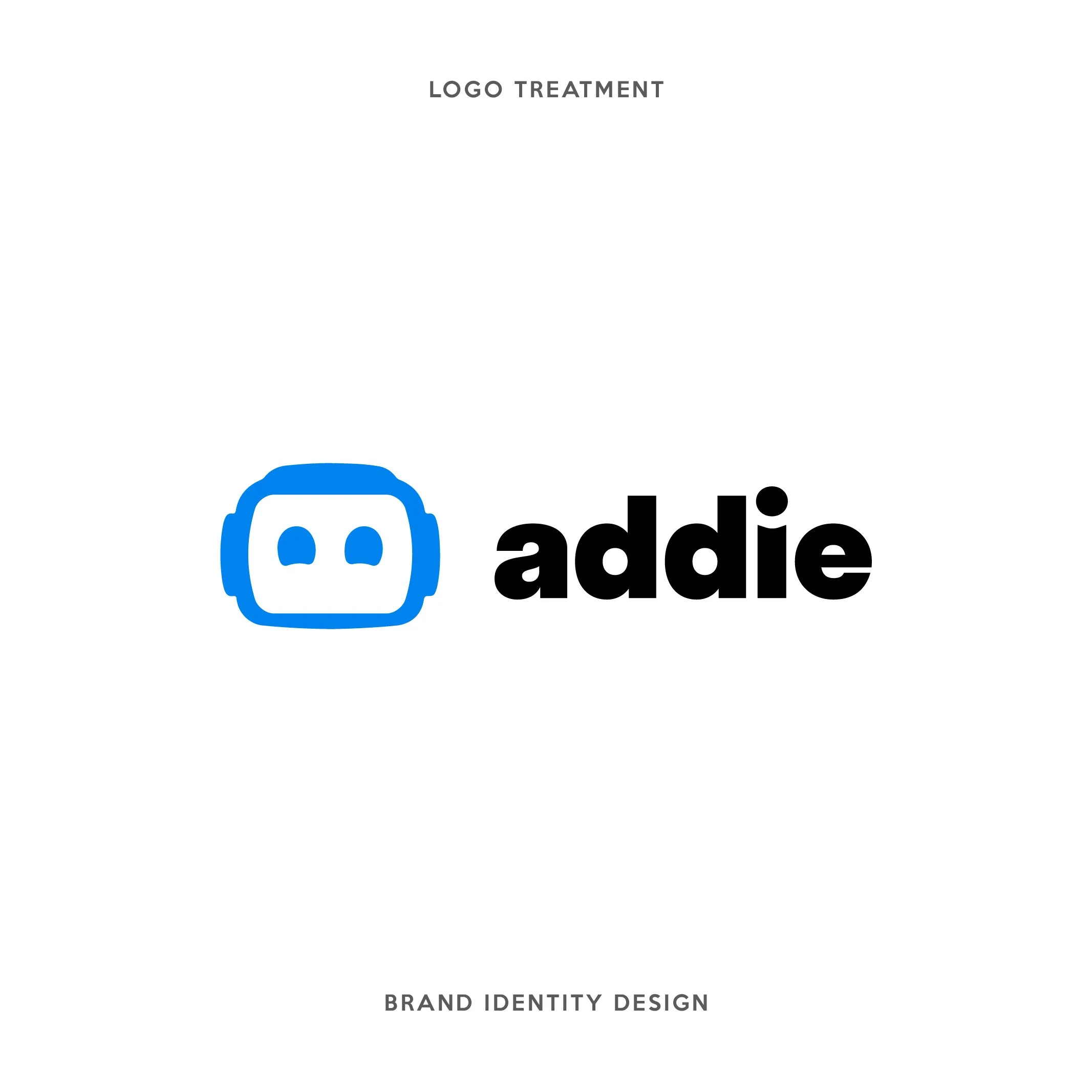
Final Logo